The soar into the stratosphere of the 1%

As one news organization after another has gotten on board the income inequality bandwagon, the graphics have gotten ever telling. Each seems to be competing to best tell the story graphically.

The WSJ had an especially good set of interactive graphics on Inequality in America lately.

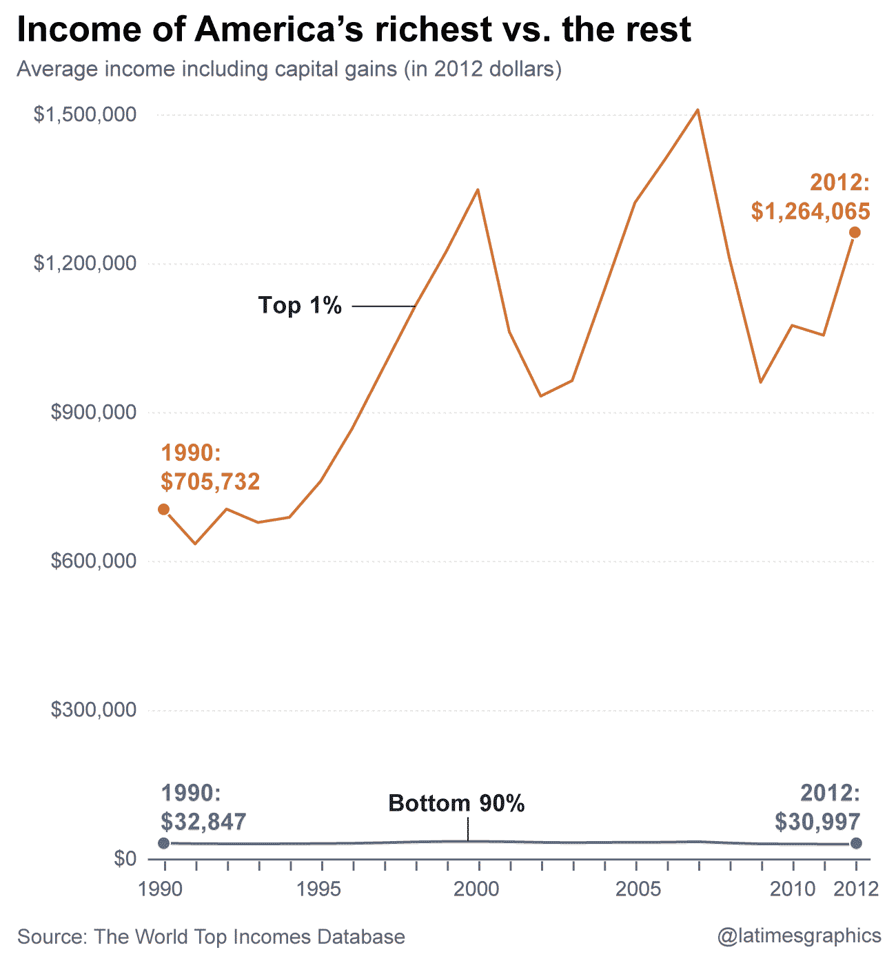
But here's the simplest and perhaps the best to date, on the soaring wealth of the 1%.

This one comes from the Los Angeles Times — give credit where credit is due.

tenpercentvsninetypercent.png

Published by Kit Stolz

I'm a freelance reporter and writer based in Ventura County.

Leave a Reply

Fill in your details below or click an icon to log in:

WordPress.com Logo

You are commenting using your WordPress.com account. Log Out /  Change )

Twitter picture

You are commenting using your Twitter account. Log Out /  Change )

Facebook photo

You are commenting using your Facebook account. Log Out /  Change )

Connecting to %s

%d bloggers like this: